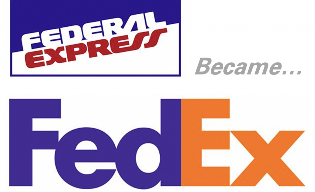
Federal Express rebranded as FedEx in the early nineteen-nineties. Shorter name. Modern slogan. But what to do about the logo? FedEx brought in Lindon Leader. Leader’s career began with Saul Bass and he had picked up Bass’s uncanny ability to say much using little. In the case of FedEx’s logo, Leader would make a statement without using anything at all. The blank space, the white space, the hole, that’s the genius of the logo that Leader produced for FedEx. When Leader’s team pitched the logo to FedEx in 1994, only the CEO Fred Smith saw it.
What was it? There’s an arrow in the E and the X. Many people know this now. But most of us have had to have the arrow pointed out. Why?
Functional fixedness, that’s the psychological term. The letter E is an E. The letter X is a X. People fix an object in their mind. This prevents people from considering other functions for the object. The example Wikipedia gives is a hammer. People can easily imagine hammering and nailing, but might overlook hammer’s use as a paperweight. Another example is an IT team seeing the service desk tool as only a way to do ticket management, overlooking the tool’s use for workflow automation. It is a problem designers face when specifying tooling for security controls.
One example of functional fixedness happened last year when I was consulting with a team on implementing Role-based access control (RBAC). As often occurs, the team wanted to jump right into tooling. Who were the RBAC vendors? What RBAC products did they need to buy? By talking about RBAC without using the specific term RBAC, we were able to break down the requirements. The team saw the human resources system (HRMS), identity provider (IdP), and lifecycle management in a new light, and were able to use them to deliver the security capability. The E and the X made an arrow.
Another example is in the Zero Trust architecture (ZTA) workshops I run. ZTA is all Es and Xs as vendors push hard to fix their implementation as the only way to do ZTA. I’ve structured the workshop to focus on actions organizations take to achieve ZTA. We spend most of the time on the verbs. Combined with framing the conversation with principles, it becomes much easier to see the functional components and brainstorm tooling to meet those components. Sure, E and X can make an arrow, but how else can we make an arrow?
These are the two ways to unlock creativity. Discuss the thing without naming the thing. Discuss what the thing does rather than what the thing is. Both these lenses enable our minds to find similar things or combine existing things in new ways.
If you want to a fun way to remember these creative techniques for breaking out of functional fixedness, check out Captain Sideways. That’s right: a superhero who helps people solve problems by seeing new perspectives. See Captain Sideways save passengers on a ship by describing a lifeboat without using its name. Then join Captain Sideways again, where he saves the skies by naming verbs of other solutions. (I’m rather disappointed this comic series didn’t go on for more adventures.) Quite fun.
Back to the FedEx logo. In 1994, only the CEO saw the arrow. Even today, most people don’t immediately see it. So why keep this as a logo? Because when we do, it’s like finding a little surprise, and the little surprise brings joy. There’s pleasure in seeing things in a new way, and when those things click into place. Today, the logo is legendary with dozens of design awards and the logo is ranked one of the best of the last four decades.
Play with the spaces between the words to design tooling. By focusing on the descriptions and the actions, we can find new ways to accomplish security controls. We can find the arrow in our own work.

This article is part of a series on designing cyber security capabilities. To see other articles in the series, including a full list of design principles, click here.
Posted by