Premature simplification is the root of bad security – Design Monday

Archive for February, 2021

Premature simplification is the root of bad security – Design Monday

Posted by

The device changed our homes. It changed our perspective of time. In a way, it’s a story of miniaturization. They used to take up entire rooms, and suddenly could fit on a desk. It’s also the story of economics. They once were so costly only corporations could own them. With falling prices and shrinking sizes, it wasn’t long before every house had one.

The personal computer revolution? No. The sewing machine.

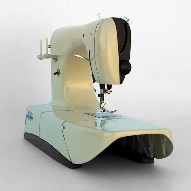
Our story begins a hundred years into the revolution. For most of those years, Singer dominated with black cast iron machines. Our design hero is Marcello Nizzoli, an Italian who refused to commit to any one discipline. He worked as a draughtsman, designed clothing and accessories, made advertisement posters, started magazines. Nizzoli’s collaboration with Olivetti was so successful, it set the standard for how Olivetti created teams of artists and engineers, paving the way for Ettore Sottsass to create the Valentine typewriter. When Necchi approached Marcello Nizzoli in the 1950s, Nizzoli had deep skills in precision machines and an instinctive understanding of those who stitch and sew.

The resulting Necchi Mirella Sewing Machine arrived in 1956. Nizzoli’s machine was light and beautiful. It features brightly colored enameled aluminum with a finely crafted metal drive mechanism. The Mirella won a number of awards and, today, is on permanent display at the New York Museum of Modern Art (MoMA). From contemporary accounts to modern documentaries, the consistent theme about the Necchi Mirella is this: user-friendly, ergonomic, and simplicity.

It was simple. We see this theme frequently when reading about good design. I return to the theme regularly in this series. Make it appealing, and keep it simple.

But simple is hard. That’s the problem.

Agreeing to Protect the Organization

Many CIOs and CISOs bicker like an old couple in a bad marriage. We make points, not progress. I wish we could watch pairs of executives argue it out and find what works. It’s too bad there isn’t an IT equivalent of what John Gottman and Julie Gottman have done with couples in the Love Lab. How can leaders have the tough conversations which lead to agreement?

Peter Coleman, inspired by Gottman, founded Difficult Conversations Lab to explore this question. What Coleman found is shocking: the root of the problem is our desire to simplify.

Our goal gets in the way of reaching our goal.

Coleman’s advice: get complicated. In conversation after conversation studied, complexity provided the space to reach agreement. When researchers framed the issue in black-and-white and primed the people with a similar simplified issue, the conversation became intractable. Often times, it was a short jump from intractable to “destructive spirals of enmity.”

The more we oversimplify requirements before speaking with peers and stakeholders, the less likely we are to come to an agreement. When we oversimplify early on, we fail to get buy-in. The resulting security controls won’t fit what the workforce needs.

Take the example of an identity. Let’s suppose we have people who change roles, going from contractor to employee. Suppose some people have multiple roles, say customer and employee. Start the conversation with the black-and-white control of all access and data being removed when a person is terminated. Watch how fast we get shutdown. An oversimplified approach leaves no middle ground for negotiating how identity gets defined and protected.

A Word of Caution

The lesson from Coleman, Gottman, and Nizzoli: Explore the complexity of the problem with the stakeholder, from their perspective.

Don’t explore the complexity with them from our perspective. If we want to enforce multi-factor authentication, we shouldn’t start by explaining complicated protocols and standards which enable MFA. But we should listen to the complex ways people work. Marcello Nizzoli’s success came from understanding how people sewed, not from explaining machinery to customers.

As we move from exploring the problem towards exploring possible solutions, we move from complexity towards simplicity. When defining the security capability, starting simple with an ugly prototype and iterating from there. When determining security controls, selecting the minimum requirements. Complexity as a starting point mustn’t be prolonged.

A Design Principle

“Premature optimization is the root of all evil in programming,” Donald Knuth once famously said. If you spent effort optimizing things before they are fully developed, you end up creating unnecessary work.

While the Necchi Mirella is praised for simplicity, Marcello Nizzoli arrived at the machine’s design only after spending years absorbing the complexity directly from those working in the clothing industry. Complexity, next empathy, then understanding, and finally simplicity. That’s good design, good programming, and that’s good security work.

Premature simplification is the root of bad security.

The Necchi Mirella Sewing Machine, designed by Marcello Nizzoli, 1956.

This article is part of a series on designing cyber security capabilities. To see other articles in the series, including a full list of design principles, click here.

Be Better, Be Different, by Asking these Questions – Design Monday

Posted by

This article comes with a recommended soundtrack: the soothing sounds of the IBM PC. The article also comes with a suggested color: beige.

If you’re thinking of beige and playing the sounds of yester-year, you’re ready to come with me on a trip of nostalgia. It was the late 1990s and several years into my career. I had spent time wiring up IBM computers to Novell NetWare servers. I had run a systems integrator business, assembling computers for the local market. The turn of the century found me at a value-added reseller who specialized in mixed Microsoft and Apple environments, which was tricky back in the day.

That’s when beige turned to color. That’s when the world grew quiet.  

The Apple iMac had arrived.

The industrial design work was led by Jony Ive. Ive pushed the Most Advanced, Yet Acceptable (MAYA) principle to its limit. The original Macintosh was an all-in-one form-factor. The iMac was, too, but with a Googie spin. It felt like a Jetson’s computer. But Apple was clear it was an Apple. The 1984 Macintosh said “Hello.” The 1998 iMac? “Hello again.”

As pretty as it was, the iMac was no toy.  “The iMac isn’t about candy-coloured computers,” Jony Ive said. “The iMac is about making a computer that is really quiet, that doesn’t need a fan, that wakes up in fifteen seconds, that has the best sound system in a consumer computer, a superfine display. It’s about a complete computer that expresses it on the outside as well.”

The iMac featured:

  • Sleek, curved, translucent in a time when all computers were square
  • A departure from legacy tech; such as the floppy disk drive, serial port, and the SCSI port
  • An embrace of emerging standards; USB, Ethernet, and WiFi
  • An integral architecture; say when a CRT mount also reduces heat and increases beauty  

None of this is an easy leap to make in a design. We tend to benchmark and copy the success of others. For example, a wave of translucent colored plastics crashed over all product categories following the iMac’s success. Walk the vendor arena at the next major conference to see the same thing happen in cyber security. Another challenge is in letting go of the past. Dell still offered computers with floppy disk drives in 2006, nearly a decade after Apple moved on. Many security programs have a similarly hard time letting go of processes and technology, long past when they’ve stopped adding value. It’s hard.

When developing the technology architecture for a new security capability, channel Ives by asking the following questions.

  • How can we challenge old assumptions about how things are done?
  • What are we currently doing that we can simply stop doing?
  • What technology do we have today that we can repurpose into something useful?
  • How can we make our work attractive to end-users?

I never forgot the first time I saw the iMac, when I heard the iMac. Beautiful. Whisper quiet. The VAR I worked with at the time was an Apple partner. They also sent us a full set of promotional posters. One still hangs in my study today. Think Different. If only it was that simple.

“The thing is, it’s very easy to be different, but very difficult to be better.”
– Jony Ives

Afterward

Ken Segall is an ad man and the author of Insanely Simple: The Obsession that Drives Apple’s Success. Segall is also the man who put the i in iMac. Steve Jobs originally had a different opinion. “He wanted us to come up with a really good name, he called us in one day and said I have a name that I really like, we’re going to go with it, but if you guys can do better we need you to do better within the next two weeks. So his name was, yes it’s true, MacMan.”

Listen to him as Ken Segall tells the story on YouTube. It’s a reminder that, with computer products or security projects, the name tells a story.

Apple iMac G3 and iBook, image courtesy Wikipedia.

This article is part of a series on designing cyber security capabilities. To see other articles in the series, including a full list of design principles, click here.

Identify friction with better data visualizations – Design Monday

Posted by

All maps are wrong. They simplify geography. They obscure detail. All maps are wrong. Some maps, however, are right in the moment.

Take cartograms. These are one of my favorite data visualizations. You’ve likely seen one during an election, abstracting states to show the population. Cartograms relish being wrong about geography. They toss land accuracy to the wind. Instead, they show one key datapoint. Clearly. Convincingly.    

The grandfather of the modern cartogram is Waldo R. Tobler.

Tobler pioneered computer-aided cartograms in the 1960s and provided researchers software into the Internet age. Frustrated with manually drawing maps, he tapped into the computing power of the University of Michigan. The results were the first algorithms for cartograms and one of the first computer movies: A Computer Movie Simulating Urban Growth in the Detroit Region. Take that, Pixar! Anyone who wrote to Tobler would get a reply with a floppy disk of code and research. As technology evolved, that little floppy would become a compact disc (CD), and finally posted online as free software (2003).

In a remembrance of Tobler, Benjamin Hennig wrote: “He made no distinction between the hierarchies in academia and gave young scholars the same respect and attention as senior academics, acting as a mentor and source of inspiration to many of them.”

Tobler was an open source map hacker.

Cyber security is in desperate need of data visualizations. We have numbers about port scans. We measure the easy things, from the number of emails received to the number of phishing emails reported. These roll up into bar charts, trend lines, and pew-pew maps. But do these visualizations actually communicate the data point we need to take action?

We need maps of what matters, not what’s happened. We need to see how data relates to fact.

“Everything is related to everything else, but near things are more related than distant things.” This is Tobler’s first law of geography. It’s applicable to security design. Consider the paths people take to complete work: number of steps, familiarity, and friction of each step. The more steps IT or cyber security places in the way, the longer the path, the greater the friction of distance.

We need visualizations that surface work arounds and work hacks. These security policy violations appear in result to friction. Identify these, and we’ll know where to adjust the design of controls.   

All metrics are wrong. They simplify and obscure. A well-designed metric, like a well-designed cartogram, can surface hidden truths about how people navigate the systems we build.

Identify friction with better data visualizations, then reduce the steps and improve the experience. That’s one way to increase compliance and adoption.


Source: Cartogram Visualization for Bivariate Geo-Statistical Data. Sabrina Nusrat, Md. Jawaherul Alam, Carlos Scheidegger, Stephen Kobourov.

This article is part of a series on designing cyber security capabilities. To see other articles in the series, including a full list of design principles, click here.