Design Thinking for Cyber Security Services – Design Monday

Archive for June, 2020

Design Thinking for Cyber Security Services – Design Monday

Posted by

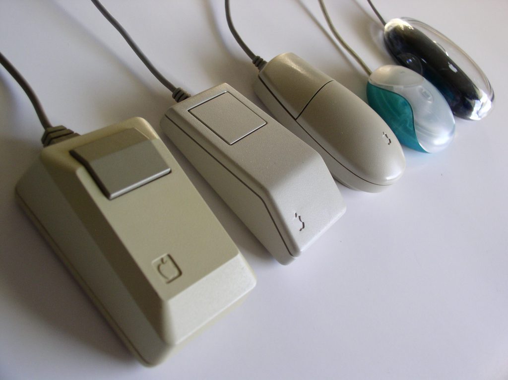
IDEO has been at the center of many fundamental designs in computing history. This includes the simple and ubiquitous mouse.

Thought it was Apple? Think again. Steve Jobs came to a firm called Hovey-Kelley in the late seventies, a firm which would become IDEO in 1991. Jobs had a problem. The only other computer mouse in existence cost 16 times what people could afford. The mouse also broke frequently and was, well, ugly. None of this would work for the Lisa and Mac.

David Kelly (of David Kelley Design, Hovey-Kelley, and later one of three founders of IDEO) assembled a team. Douglas Dayton worked on the frame. Jim Yurchenco was responsible for the mechanical design. Bill Dresselhaus, with his love of Art Deco, handled the packaging. The technology of the day was finicky and “required such precision that it probably couldn’t be mass-produced.” There were practical debates about the sound of the click, or the number of buttons. Each change required every other part to be redesigned to fit in the tiny space. But even in those early days, the firm that would become IDEO had a secret weapon.

Design thinking. IDEO refined it and popularized it. Design thinking is a way of problem solving and developing solutions that’s a departure from how we in IT have long done things. Consider the following five points of design thinking:

  1. Empathize – think about people who we’re serving (empathy is the heartbeat)
  2. Define – think about the main problem we’re trying to solve
  3. Ideate – brainstorm, mindmap, whiteboard, play
  4. Prototype – build a possible solution
  5. Test – sit down with the people and have them test the prototype

Now compare the design thinking steps to ITIL service design:

  1. Service solution – think about requirements, deadlines, costs, budgets
  2. Information systems and tools – think about the service portfolio, configuration management, capacity, and security
  3. Technology and architecture – think about designs, plans, and processes to align IT policy and strategy
  4. Design processes – think about the process model for operation and improvement
  5. Measures and metrics – think about what we’ll measure to ensure the service is working

Notice what’s missing? People. I mean, ITIL practitioners will reply, “no, no, no. We have the 4P’s: Product, People, Process, and Partner.” Fair enough. But compare the two lists. People are not the focus. And to anyone who has been in the workforce as an enterprise end-user? It shows. We can feel it. Because people designing IT and IT security don’t think much about the people who’ll use it, the people who use it don’t think much about what we’ve designed.

Case in point: credentials. Research shows that people with more technical knowledge don’t take more steps to protect their data than people with basic knowledge (User Mental Models of the Internet and Implications for Privacy and Security). Most people know they should use separate passwords for every app (91%). But most people use the same password anyways (66%). Most people know they should use MFA. But most people don’t (66%). The problem isn’t one of awareness. (Source: LastPass and Security Ledger.) In not considering how regular people use and secure technology, we’ve created a situation where people simply opt out.

Enterprise IT is a like the original mice. Xerox, the mouse Apple copied, cost $400 or $1200 in 2020 US dollars. Doug Engelbart’s, the mouse Xerox copied, required a training course that took 6-months to master the damned thing. That’s ITIL thinking. That’s the type of technology people will be aware of, but not take steps to use.

Design thinking, the focus on people and rapid prototyping, led to a mechanical mouse setup which would dominate mice designs for the next twenty years. The original Apple mouse was $25. (Adjusted for inflation, that’s $79, which is coincidentally the price Apple charges for the optical Magic Mouse in 2020.) A child could pick up the mouse and immediately use it. Most of my generation learned in grade school. It just worked, worked well, and worked at a fraction of the cost.

In my office hangs Five Phases of Design Thinking by Maisey Design. It’s a reminder. When working on security services and specific controls, keep the focus on people.

The Apple Mouse, Photography Wikipedia

This article is part of a series on designing cyber security capabilities. To see other articles in the series, including a full list of design principles, click here.

Security design, album covers, and Dieter Rams – Recap

Posted by

CyberSecurity design weekly recap for June 22-27.

This week: Peter Saville and the New Order’s Blue Monday cover. A pervasive thought in CyberSecurity is that people don’t implement controls because they’re not knowledgeable. More information means better security. The entire discipline of security awareness is based on this idea. But is this correct? I mean, Peter Saville didn’t need to listen to the music to design brilliant covers. Principle: Don’t listen to all the music.

Previously: Dieter Rams and his design principles. Be principled. Develop a small set of architectural principles to guide the technical design. Live with them. Argue them. Disagree and commit. Apply and iterate them. But be principled.

One thing more: I’ve mentioned I have Dieter Rams principles hanging in my office. The Maisey Design Shop produced the piece, which is available as a poster from Etsy or as a boxed canvas from iCanvas. It’s too late for father’s day. But, come on! There’s always a holiday coming up. Check them out.


This article is part of a series on designing cyber security capabilities. To see other articles in the series, including a full list of design principles, click here.

We don’t need to know the music – Design Monday

Posted by

Peter Saville never listened to the music before designing the album cover. The Joy Division’s Unknown Pleasures cover with the pulsar. New Order’s Blue Monday and the iconic floppy disk cover. Saville designed without all the information and this always bothered me.

A pervasive thought in CyberSecurity is that people don’t implement controls because they’re not knowledgeable. More information means better security. The entire discipline of security awareness is based on this idea. But is this correct? Some studies suggest otherwise. Take User Mental Models of the Internet and Implications for Privacy and Security, for example. Researchers found that people with technical in-depth knowledge of the Internet didn’t actually take any more steps to protecting their information than non-technical people.

Our capacity is finite. We can hold three ideas in our mind. We can remember seven digits in a sequence. We can maintain a hundred-fifty relationships with people. Our semantic memory can only hold so many facts. The question is how we use that capacity. The goal is to fill our lives with right ideas, the right facts, the right people. In other words, the right amount to take action.

Back to Peter Saville. Saville knew art. He knew symbols, shape, and color. He didn’t know what a floppy disk was before hanging out with New Order’s band. He certainly did not know binary. (His code was a base-10 system.) He put it this way: “I understood the floppy disk contained coded information and I wanted to impart the title in a coded form, to simulate binary code in a way-therefore converted the alphabet into a code using colours.” The resulting cover was the striking floppy disk with the color-coded wheel. In the end, Saville knew exactly what he needed to know to do what he needed to do. Blue Monday became one of the most recognizable covers in the late twentieth century.

When designing the specific security controls, the trick is to be Peter Saville. On the one end of the spectrum are those who don’t understand the technology enough to take action. Picture the clueless boss stereotype. On the other end are those who understand it too much and get too deep into the implementation. Consider a firewall engineer who moved into security and now spends way too much time on network security, at the expense of the rest of the security program.

Determine how much information you need to take steps towards implementing security controls. The CyberSecurity architect sets the requirements. The IT subject matter expert implements technology to meet the requirement. Know enough, yes. But don’t waste time listening to the music.

New Order Blue Monday cover by Peter Saville, photography as credited.

This article is part of a series on designing cyber security capabilities. To see other articles in the series, including a full list of design principles, click here.

Security design, the art of Chindōgu, and denim jeans – Recap

Posted by

CyberSecurity design weekly recap for June 15-20.

This week: Kenji Kawakami and the Japanese art of Chindōgu. From shoe umbrellas to chopsticks with cooling fans, the playful anarchy unlocks our creativity. Toss aside the checklists. Have fun with the controls. Forget being productive for a moment. Forget being useful. Join the un-useless revolution. Principle: Take controls from useless to un-useless to useful.

Previously: Bart Sights and Levi denim jeans. When planning the implementation and ongoing operations, consider how the technology can develop a patina. Think of it like denim jeans, where every day, every wear, the jeans and security becomes better molded to you. Principle: Plan to wear in, not wear out.

One thing more: Check out The World According to Jeff Goldblum on Disney. Generally, it’ll inspire you. Specifically, episode 104 is on Denim and Goldblum visits Bart Sights Eureka Labs.


This article is part of a series on designing cyber security capabilities. To see other articles in the series, including a full list of design principles, click here.

Take controls from useless to un-useless to useful – Design Monday

Posted by

Kenji Kawakami started a useless revolution. Or perhaps better said, an un-useless revolution.

The art of Chindōgu, which Kenji Kawakami invented, is the art of creative problem solving. There are principles, of course. (Aren’t there always?) Chindōgu address real problems, like the shoe umbrellas keeping the top of our shoes dry. They aren’t useless. Unlike Rube Goldberg machines, Chindōgu emphasize simplicity and practicality. You must actually build a Chindōgu design for it to be considered a Chindōgu. Oh yes, Kawakami built chopsticks with a cooling fan. “There must be the spirit of anarchy,” goes one principle, and the resulting design makes people laugh by “finding an elaborate or unconventional solution to a problem.”

CyberSecurity needs a spirit of anarchy. Security needs a spirit of play. The reason many of us got into this line of work? It was fun. Perhaps security needs Chindōgu.

There’s no place in more need of the Chindōgu spirit than control selection. We have pages upon pages of standards. We have checklists with best practices. The audit and compliance team handed over a list of regulatory requirements. Forget all that. Get together over a whiteboard and start brainstorming. How can the team meet the most controls with the least effort? What’s a fun way to do some of the controls? Remember, not useless. Un-useless.

Once I led a workshop such as this. We ended up with a game of Mousetrap implemented with a series of Python scripts. As the adversary followed their attack path, like a marble rolling down the track, a series of humorous actions befell them. We had a blast.

The book 101 Un-Useless Japanese Inventions includes a telescoping hand for taking photos. Here’s the problem. A Chindōgu is a tool that a person could use, while paradoxically, a Chindōgu is a tool that no one would actually use. But the telescoping hand, or as it is known today, the selfie stick, took off. The stick graduated from Chindōgu to being useful, a must-have for tourists. Our Mousetrap scripts met a similar fate, serving as the inspiration and starting point for an Endpoint Detection and Response (EDR) platform.

Bringing back the playful anarchy unlocks our creativity. Toss aside the checklists. Have fun with the controls. Forget being productive for a moment. Forget being useful. Join the un-useless revolution. You’ll be surprised at where the security controls end up.

A 360-degree camera hat for taking panoramic pictures, photography by Amusing Planet.

This article is part of a series on designing cyber security capabilities. To see other articles in the series, including a full list of design principles, click here.

Security design, aesthetics, and MRI machines – Recap

Posted by

Security design weekly recap for June 8-13.

This week: Paul Hekkert and the Unified Model of Aesthetics. \When work looks like work, work gets done. But there’s a problem. The best way to keep things familiar is to keep things the same. Yet we design security capabilities to push things forward. Principle: Balance familiarity with novelty.

Previously: Doug Dietz and the GE Healthcare MRI for children. We don’t talk to kids about the MRI. We talk to them about the jungle experience. We don’t talk to end-users about passwordless. We talk to them about a more enjoyable work experience. Good design begins with empathy. Principle: Empathy is the Heartbeat.

One thing more: You can watch Doug Dietz on the TED stage talking about empathy. Transforming healthcare for children and their families: Doug Dietz at TEDxSanJoseCA 2012

Balance Familiarity with Novelty – Design Monday

Posted by

When work looks like work, work gets done. The concept is a cornerstone for my security philosophy. You want buy-in and adoption? Maximize specificity and familiarity.

But there’s a problem. The best way to keep things familiar is to keep things the same. Yet we design security capabilities to push things forward. When we push too far forward, when we push too hard, we lose people. Best case, we get low adoption. Worst case, we get outright revolt. So, on one end of the spectrum, we have comfortable stagnation. On the other end, uncomfortable transformation. How do we strike a balance?

Paul Hekkert offers guidance. Hekkert has been working on the Unified Model of Aesthetics. The research starts with a very simple question: why do we like things? Hekkert’s team has found that it comes down to acting on similar but opposing ideas: unity versus variety, connectedness versus autonomy, typicality versus novelty. The last pair addresses our problem as security designers.

“People find those products the most beautiful that are the most sophisticated but at the same time comprehensible and familiar. That is the boundary that designers need to work with. It’s a fine line that varies between users,” Hekkert explained to TU Delft. “It does not mean that everyone has a different idea about what is beautiful. In very many respects, we agree on what is beautiful or new, particularly if we share a similar background, come from the same culture, or have had similar experiences. A principle such as this can help us understand why and when people find the same things beautiful or, in contrast, differ in taste.”

Balancing familiarity with novelty brings joy. Previously, we talked about leveraging the metaphor to bring understanding. In both cases, the underlying idea is calibrating the pace of change to the end-user’s sensibilities. For example, rolling out a new IAM/IGA tool for managers to review and certify access (Identity Access Management / Identity Governance and Administration). If people are already doing access reviews, the novelty of an easier user interface which is consistent with the metaphor of least privilege can bring a bit of joy. It’s easier. It’s faster. At a minimum, it’s an acceptable change.

Most Advanced, Yet Acceptable (MAYA) is the name Hekkert has given this principle. How advanced can the design be while still remaining familiar, still being acceptable, still looking like work? The answer will vary from organization to organization due to culture. But the question must remain top of mind for security leaders pushing the envelope.

Most Advanced, Yet Acceptable (MAYA), chart from Paul Hekkert et al.

This article is part of a series on designing cyber security capabilities. To see other articles in the series, including a full list of design principles, click here.

Security design, Comic Sans, and the HAL 9000 – Recap

Posted by

Security design weekly recap for June 1-6

This week: Vincent Connare and Comic Sans. Turns out, security controls are a bit like Comic Sans. They have their places. But when not in their place, they’re imminently mockable. Use controls thoughtfully. Principle: Everything is right somewhere. Nothing is right everywhere.

Previously: Ettore Sottsass and the Elea 9003, the inspiration for the HAL 9000. Securing by what we can measure in dollars leads to decisions which are blind to the human factors. When introducing human-centric design to our security programs, we must consider all the ways people determine value. Principle: Remember the subjective. Remember the chairs.

One thing more: “Andrea Granelli – president of Kanso, former chairman of the Olivetti Foundation and CEO of Telecom Italia Labs – talks about the past looking at the future. Inspired by the symbolism of our Olivetti Cafeteria, and next to a P101 – the very first personal computer in history – Granelli’s presentation focus on the connection between design and innovation, and about Olivetti Foundation as a paradigmatic example of that relation.” Watch on YouTube here.

Everything is Right Somewhere – Design Monday

Posted by

Modularity and reuse are top of mind when we design cybersecurity capabilities. Our design should break down into a number of building blocks. These can be technical, like network segmentation. Building blocks can be architectural, like a DMZ or demilitarized zone networks. At the top-level, we can have solution building blocks which are product-specific, such as VMware NSX micro-segmentation for untrusted networks. From technical to architectural to solution, we move up in specificity. This is great for reuse. But it does pose a problem, for a building block that’s perfectly right in one area can be perfectly wrong in another.

Think about it like a font. In fact, think about it like the world’s most controversial font: Comic Sans. Vincent Connare is a noted type designer who worked with Microsoft in the 1990s. In 1994, Connare drew inspiration from Marvel and DC comics to develop the new Sans font. The original use case was cartoon characters in an ill-fated Microsoft GUI. But the font outlived its original purpose. Why? Because it is kid-friendly, warm, and in direct contrast with most every other font on Windows and Mac. People love the font almost as much as people hate it.

The designer Corey Holms said once told The Guardian that “Comic Sans is proof positive that design works, the public gets it and understands that type means more than just words.”

Comic Sans is perfect for a playful comic. It’s perfectly wrong for warning signs about electrocution. Sure, use Comic Sans on an ice cream truck. Don’t use it on an ambulance. Buzzfeed has an entire listicle of several Comic Sans fails. The point is, the font isn’t wrong. The usage is.

Use building blocks thoughtfully. Everything is right somewhere. Nothing is right everywhere.


This article is part of a series on designing cyber security capabilities. To see other articles in the series, including a full list of design principles, click here.