All maps are wrong. They simplify geography. They obscure detail. All maps are wrong. Some maps, however, are right in the moment.
Take cartograms. These are one of my favorite data visualizations. You’ve likely seen one during an election, abstracting states to show the population. Cartograms relish being wrong about geography. They toss land accuracy to the wind. Instead, they show one key datapoint. Clearly. Convincingly.
The grandfather of the modern cartogram is Waldo R. Tobler.
Tobler pioneered computer-aided cartograms in the 1960s and provided researchers software into the Internet age. Frustrated with manually drawing maps, he tapped into the computing power of the University of Michigan. The results were the first algorithms for cartograms and one of the first computer movies: A Computer Movie Simulating Urban Growth in the Detroit Region. Take that, Pixar! Anyone who wrote to Tobler would get a reply with a floppy disk of code and research. As technology evolved, that little floppy would become a compact disc (CD), and finally posted online as free software (2003).
In a remembrance of Tobler, Benjamin Hennig wrote: “He made no distinction between the hierarchies in academia and gave young scholars the same respect and attention as senior academics, acting as a mentor and source of inspiration to many of them.”
Tobler was an open source map hacker.
Cyber security is in desperate need of data visualizations. We have numbers about port scans. We measure the easy things, from the number of emails received to the number of phishing emails reported. These roll up into bar charts, trend lines, and pew-pew maps. But do these visualizations actually communicate the data point we need to take action?
We need maps of what matters, not what’s happened. We need to see how data relates to fact.
“Everything is related to everything else, but near things are more related than distant things.” This is Tobler’s first law of geography. It’s applicable to security design. Consider the paths people take to complete work: number of steps, familiarity, and friction of each step. The more steps IT or cyber security places in the way, the longer the path, the greater the friction of distance.
We need visualizations that surface work arounds and work hacks. These security policy violations appear in result to friction. Identify these, and we’ll know where to adjust the design of controls.
All metrics are wrong. They simplify and obscure. A well-designed metric, like a well-designed cartogram, can surface hidden truths about how people navigate the systems we build.
Identify friction with better data visualizations, then reduce the steps and improve the experience. That’s one way to increase compliance and adoption.
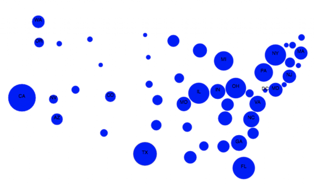
Source: Cartogram Visualization for Bivariate Geo-Statistical Data. Sabrina Nusrat, Md. Jawaherul Alam, Carlos Scheidegger, Stephen Kobourov.
This article is part of a series on designing cyber security capabilities. To see other articles in the series, including a full list of design principles, click here.
Posted by