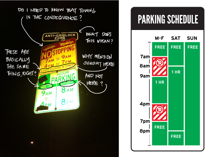
Security is not the control, it is the context – Design Monday

Archive for the ‘Design’ Category

Security is not the control, it is the context – Design Monday

Posted by

Seeing is Forgetting the Name of the Thing One Sees. A fantastic title, right? I was having a coffee meeting with a new product designer a few months back. As can happen, I was pretty wound up, going on about the need for usability and human-centric design in cybersecurity. She told me, “you need to read Seeing is Forgetting the Name of the Thing One Sees.”

The book covers conversations Lawrence Weschler, the author, had over three time periods with Robert Irwin. It gets to the heard of Irwin’s philosophy and approach. Irwin began abstract in the 1960s. He painted lines. He painted dots. But when displaying his work, Irwin noticed the way the art was experienced was influenced by factors outside of his paintings. Any of us who have seen optical illusions with colors and lines understand this instinctively and likely think nothing of it. But to Irwin, who was obsessed with the experience to the point of banning photography, this simply wouldn’t do. Irwin took to replastering and repainting walls, sometimes whole studios, where his art was displayed.

Robert Irwin insisted on controlling the entire experience and this led to the realization that the surroundings were just as important as the artwork itself.

We’ve been slow at coming to a similar realization in cybersecurity. Consider the Web application. A thousand things have to go right for it to work, and a thousand things can go wrong from a security perspective. OWASP framed these issues up into a top 10 list. This simplified the work of developing a secure Web app. However, OWASP initially focused solely on the app itself.  Of the six releases since 2003, only the last two releases included the walls and studios, the vulnerable server components, on the OWASP top 10. We’re slow to recognize the importance of the surroundings.

Robert Irwin’s obsession with the surroundings transformed the artist from painter to landscaper. He has gone on to produce more than fifty large scale projects since 1975.

From the perspective of a designer, we must consider how the new capability fits into the existing cybersecurity portfolio and, more broadly, into the organization. We have to replaster the walls. We must make sure it fits in the studio. From the defensive perspective, this makes a lot of sense. A criminal faced with a strong control will look at the environment for other weaknesses and take advantage of gaps. From the usability perspective, Robert Irwin reminds us that how something is seen is as much about the thing as it is about the overall experience.

Security is not the control itself. Security is the surroundings.

Robert Irwin’s Double Blind exhibit at the Vienna Secession, Austria.
Photography: Philipp Scholz Ritterman

This article is part of a series on designing cyber security capabilities. To see other articles in the series, including a full list of design principles, click here.

The Work of Luck – Design Monday

Posted by

It is the final task of an implementation. The stakes are high. One of your people hits a wrong button. The entire system comes crashing down. My question: Is this good luck, or bad?

For an answer and inspiration, I look to Massimo Bottura. Bottura is a chef and restauranter. At his Michelin 3-star restaurant, Osteria Francescana, a similar situation played out. The pastry chef, Taka Kondo, was platting the final course. One tart slipped. Smash! And to Kondo’s surprise and relief, Massimo Bottura burst out laughing. Good luck! The Oops! I dropped the lemon tart was born. The dessert has become legend.

You can hear Bottura tell the story himself at the video below. For now, I want to turn to the question of how to get lucky. So many things must go right when deploying technology, we can use all the luck we can get.

One factor in seeing the opportunity in accidents is associative barriers. High associative barriers lead to functional fixedness. By contrast, people with low associative barriers tend to find connections and opportunities others don’t. I’ve previously covered techniques to get beyond functional fixedness: discuss an item without naming it, and discussing what an item does rather than it is. (See Play with the spaces between the words.) Here, let’s cover building new associations.

New associations can prime us to turn accidents into good luck. It provides a larger net for catching ideas. The exercise is simple. List the assumptions. Imagine what would happen if the opposite were true. We can (and probably should) do this at multiple stages in designing security capabilities; from the vision to our assumptions about the organization, the security function, the security controls, the tools, and our assumptions about implementation. For example:

  • A tart from a Michelin 3-star restaurants is carefully plated and perfectly constructed.
    • It is messily deconstructed. Innovation: Oops! I dropped the lemon tart.
  • The authenticating security credential is a person’s ID and password.
    • A person can authenticate without a password. Innovation: passwordless.
  • A security perimeter is enforced by the network, that is, by a firewall.
    • A perimeter is enforced regardless of network. Innovation: Zero Trust.
  • Defense-in-depth necessarily means having deep control coverage.
    • Defense can be achieved with only a few controls. Innovation: attack path.

The other factor in finding the opportunity in accidents is time. Rushed people don’t get lucky. Stressed people don’t get opportunities. The psychology of stress and time shows people develop tunnel vision and repeat well-known and practiced techniques. The same is equally true for rushed and stressed projects and initiatives. The same goes for rushed and stressed teams and operations. This is an anathema to getting lucky, of course. We’re highly unlikely to see possibilities and to take them on when in this state. Buffer time and down time create the space for getting lucky.

“Leave a free space for poetry. Leave a free space from obligation. You have to be ready to see what others don’t even imagine,” Massimo Bottura says in the video below. He could be speaking directly to us about designing security capabilities. “Make visible the invisible.”

Massimo Bottura tells the story behind Oops! I dropped the tart.

This article is part of a series on designing cyber security capabilities. To see other articles in the series, including a full list of design principles, click here.

Mies and IBM Plaza: Knowing When More is More – Design Monday

Posted by

The building came into view. My vantage point was on the Chicago River. It was Valentine’s Day. Now Chicago natives had warned us about the cold February winds. But there my wife and I were, on a river tour of Chicago’s architecture. Frozen to the ship’s deck, we looked up as the IBM Plaza came into view.

Ludwig Mies van der Rohe designed the building in the 1960s. Mies came from the famed Bauhaus school, another of my favorite sources of inspiration. In fact, Mies was the last director of Bauhaus. He moved from Berlin to Chicago in 1937 to head the architecture department of Illinois Institute of Technology. There’s a direct line from Bauhaus to Second Chicago School of architecture. Specifically, in minimizing ornamentation in favor of emphasizing building materials themselves.

It was this modernism which drew IBM to Mies van der Rohe. But there was a problem. Many, in fact, with the building IBM wanted. Computing technology of that age was notoriously hot and power-hungry. Moreover, computer engineers were at a premium, which meant a large workforce with little patience for waiting on elevators. Every minute counted. Moving to the ground, the lot was an oddly shaped. Triangular. It sat partially atop of a train line which restricts the foundation needed for a skyscraper. And to top it off, the site had an agreement to provide storage for the Sun-Times. That’s a lot.

“Less is more” was popularized by Mies van der Rohe. Boil down architectural requirements to the essentials. In cybersecurity, we’ve embraced less is more. You see it in concepts like least privilege, least trust (aka Zero Trust), economy of mechanism, and limited security blast radius. You see it in my security principles; like when I discuss building Roombas not Rosies. Less is more is a reminder to take a minimalist approach.

Even from the Chicago River, you can feel the minimalism of the IBM Plaza. The exposed vertical beams, the glass and steel materials on full display. Less is more. But it’s more than it seems. The building has more than double the elevators of a comparable building. The cooling system is similarly over-powered. Designed by C.F. Murphy, the HVAC is tuned for 1970s era computing. Mies also made several floors to be taller to support raised flooring, and reinforced to support the weight. The building is subtly shifted back to make use of the lot, with weight shifted back onto a strong foundation. This feature explains the open pillars in front and allowed Meis to neatly avoid the question of the railway. Less is more? If anything, much of the IBM building is overdone.

Less is more is not a call for doing less. It is a reminder to save our energies to do more where it counts. It is a reminder to pour the savings into solutions for the problem at hand. When we save resources for priorities, less isn’t loss.

IBM moved into IBM Plaza in 1971. For more than three decades, the building was the Chicago office of the tech giant. “The building was declared a Chicago Landmark on February 6, 2008 and added to the National Register of Historic Places on March 26, 2010.” Today, the building at 330 North Wabash is known as the AMA Plaza. It stands as a testament to Ludwig Mies van der Rohe’s ability to balance less and more.

The design lesson: More of what matters is more.

The floating foundation of 330 North Wabash, Chicago. Photography by Ryan Cramer.

This article is part of a series on designing cyber security capabilities. To see other articles in the series, including a full list of design principles, click here.

Build Roombas not Rosies – Design Mondays

Posted by

The Jetsons debuted this month in 1962. The cartoon depicted a family living a hundred years in the future, 2062. The swooping architectural style, with the quite fun name Googie, serves as the visual language of the future in shows from The Incredibles to Futurama. The everyday gadgetry in the Jetsons foreshadows today’s drones, holograms, moving walkways and stationary treadmills, flat screen televisions, tablet computers, and smart watches.

Remember color television was on the very cutting edge of technology when The Jetsons debuted. This list is impressive. But that smart watch? That last one wasn’t by accident.

The dominant smart watch in 2020 is the Apple Watch, designed by Marc Newson and Jony Ive. In an interview with the New York Times, Marc Newson explained his fascination with the Jetsons lead him into the world of design. “Modernism and the idea of the future were synonymous with the romance of space travel and the exotic materials and processes of space technology. Newson’s streamlined aesthetic was influenced by his Jetsonian vision of the future.” I imagine the first time Newson FaceTimed Jony Ive on an Apple Watch, they felt the future had finally arrived.

Designing the future has constraints that imagining the future lacks.

For starters, people and culture constrain innovation. Consider George and his flying car, Elroy and his jetpack, and space tourism. All these are technically feasible in 2020. But I wouldn’t trust a young boy with a jetpack, nor would most of us have money for a trip to the moon. Another constraint is technical complexity. Sure, we have talking dogs. But the reality is much different from the Jetson’s Astro. And yes, we have AI and robotics. But Siri is no R.U.D.I.

When designing future security capabilities and controls, we need to identify and quantify the constrains. One technique for this is the Business Transformation Readiness Assessment. Evaluate factors such as:

  • Desire, willingness, and resolve 
  • IT capacity to execute
  • IT ability to implement and operate
  • Organizational capacity to execute
  • Organizational ability to implement and operate
  • More factors here: https://pubs.opengroup.org/…/chap26.html

With this evaluation, we can rank what’s feasible against what’s needed. We can act on areas with momentum (desire, willingness, resolve) and build capabilities that can be maintained. But! There’s one additional step.

We don’t need a robot to push around a vacuum when we have a robot vacuum. We don’t need a full AI/ML deep learning platform when we can have a well-tuned SIEM. Implement security in a minimum viable way.

Identify the constraints. Select the security capability the organization is most ready for. Then build Roombas, not Rosies.

Rosie the Robot, The Jetsons, Photography by Brilux.

This article is part of a series on designing cyber security capabilities. To see other articles in the series, including a full list of design principles, click here.

Make Security an Inside Job – Design Monday

Posted by

We landed a man on the moon before we had wheeled suitcases. Wait. I’ll do one better. We were orbiting space shuttles before we had wheeled suitcases. I heard this fact years ago and it blew me away. I asked, why?

It took an inside guy solving his problem his way. Picture modern travel luggage. Wheels on the bottom, telescoping handle on the top, right? Robert Plath invented this in 1987 in outside of his day job as a Northwest Airlines pilot. (United States patent 4,995,487, if you’re interested.) It was a classic garage inventor success story. Plath developed and tested the prototypes, the idea took off, and he founded Travelpro and began selling the suitcases under the label Rollaboard.

The first design lesson: the person doing the job is the right person to ask about how to improve the job. Good security is usable security.

A while back, I was consulting on a privileged access management (PAM) security capability. The security objective was that all administration be performed from a dedicated laptop, using a separate credentials, through sessions that were monitored and recorded. Try selling that level of control, that level of friction, and that level of change to the administrators. Yeah. Good luck with that approach.

Instead, we found the Robert Plath of systems administration. Instead of pitching security, we asked him how heavy his bags were to carry. The team approached PAM as an admin productivity project. Wheels on bottom. Telescoping handle on top. The resulting privileged access workstations (PAWs) reduced access time and simplified systems administration tasks. While the PAM controls added friction, due to the insights and efforts of Plath the systems admin, these were offset by time savings. This is the inside edge that collaboration can bring.

Returning to the actual Robert Plath, there’s one more lesson in designing capabilities. Surely, you must be thinking, other people thought to add wheels to suitcases in the first six decades of commercial air travel. You’re right. Bernard Sadow came up with a design decades before Plath. (United States patent 3,653,474, again, if you’re interested.) It’s effectively a traditional suitcase with castors on one side. I have one. Let’s just say it isn’t the easiest luggage to use. But that wasn’t the main problem. Adoption and culture was.

Bernard Sadow made luggage. Robert Plath flew planes. Sadow had to sell into the market. This ran into cultural issues because, back then, one sure way to show your strength as a man was to carry luggage. Plath just handed his prototypes to flight crews. Not only was Plath’s luggage better, suddenly, it was the cool kids’ luggage. In other words, Sadow pitched safety glasses and Plath offered Ray-Bans.

The final design lesson is planning for adoption is planning for success. Good security takes flight when widely adopted.


This article is part of a series on designing cyber security capabilities. To see other articles in the series, including a full list of design principles, click here.

Play with the spaces between the words – Design Monday

Posted by

Federal Express rebranded as FedEx in the early nineteen-nineties. Shorter name. Modern slogan. But what to do about the logo? FedEx brought in Lindon Leader. Leader’s career began with Saul Bass and he had picked up Bass’s uncanny ability to say much using little. In the case of FedEx’s logo, Leader would make a statement without using anything at all. The blank space, the white space, the hole, that’s the genius of the logo that Leader produced for FedEx. When Leader’s team pitched the logo to FedEx in 1994, only the CEO Fred Smith saw it.

What was it? There’s an arrow in the E and the X. Many people know this now. But most of us have had to have the arrow pointed out. Why?

Functional fixedness, that’s the psychological term. The letter E is an E. The letter X is a X. People fix an object in their mind. This prevents people from considering other functions for the object. The example Wikipedia gives is a hammer. People can easily imagine hammering and nailing, but might overlook hammer’s use as a paperweight. Another example is an IT team seeing the service desk tool as only a way to do ticket management, overlooking the tool’s use for workflow automation. It is a problem designers face when specifying tooling for security controls.

One example of functional fixedness happened last year when I was consulting with a team on implementing Role-based access control (RBAC). As often occurs, the team wanted to jump right into tooling. Who were the RBAC vendors? What RBAC products did they need to buy? By talking about RBAC without using the specific term RBAC, we were able to break down the requirements. The team saw the human resources system (HRMS), identity provider (IdP), and lifecycle management in a new light, and were able to use them to deliver the security capability. The E and the X made an arrow.

Another example is in the Zero Trust architecture (ZTA) workshops I run. ZTA is all Es and Xs as vendors push hard to fix their implementation as the only way to do ZTA. I’ve structured the workshop to focus on actions organizations take to achieve ZTA. We spend most of the time on the verbs. Combined with framing the conversation with principles, it becomes much easier to see the functional components and brainstorm tooling to meet those components. Sure, E and X can make an arrow, but how else can we make an arrow?

These are the two ways to unlock creativity. Discuss the thing without naming the thing. Discuss what the thing does rather than what the thing is. Both these lenses enable our minds to find similar things or combine existing things in new ways.

If you want to a fun way to remember these creative techniques for breaking out of functional fixedness, check out Captain Sideways. That’s right: a superhero who helps people solve problems by seeing new perspectives. See Captain Sideways save passengers on a ship by describing a lifeboat without using its name. Then join Captain Sideways again, where he saves the skies by naming verbs of other solutions. (I’m rather disappointed this comic series didn’t go on for more adventures.) Quite fun.

Back to the FedEx logo. In 1994, only the CEO saw the arrow. Even today, most people don’t immediately see it. So why keep this as a logo? Because when we do, it’s like finding a little surprise, and the little surprise brings joy. There’s pleasure in seeing things in a new way, and when those things click into place. Today, the logo is legendary with dozens of design awards and the logo is ranked one of the best of the last four decades.

Play with the spaces between the words to design tooling. By focusing on the descriptions and the actions, we can find new ways to accomplish security controls. We can find the arrow in our own work.

Federal Express (1973-1994) and FedEx (1994-) Logos

This article is part of a series on designing cyber security capabilities. To see other articles in the series, including a full list of design principles, click here.

Let Go of the Past to Design the Future – Design Monday

Posted by

Music originally filled our homes both physically and metaphorically. Radios and phonographs were of polished wood and polished brass. I have a Brunswick Phonograph from this period. It’s larger than my desk. In the 1920s, music was furniture.

A hundred years has completely transformed how we play music. The revolution sparked off in 1934, when Ekco released a radio that shook off the dead wood. Within that spark, there’s a lesson for cybersecurity.

Ekco, or E.K. Cole Ltd. in England, held a design competition. Scores of designers entered. Ekco received scores of designs. At worst, the designs were plastic copies of the furniture. At best, these designs had ornamentation which looked like the radios of the day. Wells Coates entry was a radical departure. But before we get to Coates, let’s talk a bit about the human need to copy what has come before.

Skeuomorph. That’s the design term. Skeuomorphism is one way to take a design one metaphor at a time, by keeping cues that remind people of what came before. A good example today is the Tesla and other electric cars having front grilles, a callback to when air cooled the gasoline engine. Skeuomorphism makes the new feel familiar, but it can also be a trap. Consider that most cars blow air in three directions: feet, face, or defrost. It is a holdover from when a physical tube controlled airflow and the tube only pointed in one direction at a time. Just as there’s no need for a grill, there’s no need for this climate control limitation.

Wells Coates put it this way: “We must not forget that the past all too often obstructs our view of the future.”

Coates looked beyond the past to come up with a round radio, a plastic radio, a radio that came in colors, a radio that was free from skeuomorphism. I wonder how Coates did it. Was it because he was an architect and not a product designer? Was it because, though Canadian, Coates was born in Japan and had traveled the world before he turned 18? Whether being an outsider or having range contributed, or something else, Wells Coates and Ecko redefined the product category. “They started to get a character and identity of their own, a radio-ness about them if you will, that was separate and different from furniture,” designer Dick Powell explained in The Genius of Design. With the Ecko AD-65, “their new identity was forged and off radios went.”

Research into user interface design finds skeuomorphism softens the adoption curve for those familiar with the past products. (See: Affordances and Metaphors Revisited.) But skeuomorph designs don’t do anything for people who are completely new to both the interface and the metaphor.

When protecting the organization, the first question is whether the security capability will be new to the organization or an extension of what’s in place now. If it is an improvement, giving a nod to the past by carrying certain things forward will ease adoption. If it’s completely new, best to throw away the furniture and start fresh.

Let go of the past to design the future.

Ekco AD-65, Designed by Wells Coates

This article is part of a series on designing cyber security capabilities. To see other articles in the series, including a full list of design principles, click here.

Reuse and Reduce – Design Monday

Posted by

Expos and tradeshows never end well. When the show’s over, many become ghost towns. Many more end up in the trash. Annually, the estimate is 600,000 tons of waste. So, it’s no surprise the recyclable People’s Pavilion at Dutch Design Week caught my attention.

The People’s Pavilion also gave me insights into a question people frequently ask: how can security programs get the most out of what they have? The answer is complicated because much of security comes from outside of the security program.

Take the CIS Critical Security Controls, for example. At the time of this article, the current version is 7.1 published last April 2019. As you read through the controls, it becomes obvious most are not owned by the security function. More than half the controls are well-configured IT. IT inventory and configuration, IT monitoring, IT backup and recovery. Add a well-configured perimeter, wired, and wireless network. In fact, it isn’t until the last few controls that security takes a front seat. Awareness training, incident response, and penetration testing. IT is the majority and the priority in the CSC.

In the beginning of my career, security was another word for doing IT right. Well-configured IT. This thinking may make a comeback as misconfigurations are rise as a cause of security breaches. In the Verizon Data Breach Investigations Report (DBIR), they write: “Errors definitely win the award for best supporting action this year. They are now equally as common as Social breaches and more common than Malware, and are truly ubiquitous across all industries. Since 2017, Misconfiguration errors have been increasing” and account for more than 40% of errors in the 2020 report.

Back to the People’s Pavilion at Dutch Design Week 2017.  “The building is a design of bureau SLA & Overtreders W. The designers have given a radical new impulse to the notion of a circular economy: the pavilion is made with 100% borrowed materials. Materials from suppliers and producers, but also from Eindhoven residents. Concrete and wooden beams, facade elements, glass roof, recycled plastic cladding: everything is borrowed for 9 days and will be returned to the owners after the DDW.” To demonstrate nothing went to waste, they photographed all the materials when received and when returned. The images were identical, documenting the full process.

When building and implementing a security capability, consider it like the People’s Pavilion, with a majority of the components coming from the IT team. Determine what those parts are. Determine how they’re supplied (with, for example, SIPOC diagrams.) Determine who will be responsible (with, for example, RASCI charts.) Reduce any waste in building the security capability. And finally, to prepare for future projects, design for disassembly.

To get the most out of a security program, begin with the configuration and operation of secured IT. Then reduce any wasted effort and smooth out the hand-off between security and IT.

People’s Pavilion, Dutch Design Week 2017, Photography by Filip Dujardin

This article is part of a series on designing cyber security capabilities. To see other articles in the series, including a full list of design principles, click here.

Start projects like movies – Design Monday

Posted by

Saul Bass forever changed cinema.

Saul Bass designed corporate identities. He created movie posters. In both, his signature style was minimalism and clarity. Consider the iconic AT&T bell logo (1969), or the Magnificent Seven poster below (1960). Clean. Concise. But he is best remembered by his reimagining of the movie title sequence. Originally, the titles were how the film provided credits. And because of this, people naturally ignored them, using the time for a concession run.

Saul Bass saw it differently: “The audience involvement with the film should begin with the first frame. Use titles in a new way to create a climate for the story that was about to unfold.” Take my favorite of his title sequences: Grand Prix (1966). The engine revs. The cars come into view. The engineers and mechanics movements are isolated, amplified, repeated, glorified. Everything about those first few minutes pumps me up. I frankly can’t recall anything else about the film. But I never forgot that intro.

Of course, my reaction was a bit of a problem for studios. “There was a backlash against inventiveness in credit design, first from the industry and then from at least one well-known critic.” Jan-Christopher Horak writes in Saul Bass: Anatomy of Film Design. Quoting Variety in 1957, “An offbeat credit runoff, while pleasing to the patrons, does an injustice to the talent since the audience’s attention is diverted from the names.”

Let’s put Saul Bass’s story aside for a moment and turn towards designing and architecting cyber security capabilities. In the final phase, when planning the implementation, how are we treating the critical beginning of the project?

Most kick-off with the equivalent of running credits while stakeholders are getting popcorn. A 2018 study by the Project Management Institute (PMI) into project failures reflects this status quo. Projects failed due to vision (29%), poor communication (29%), and unsurprisingly, inadequate support from stakeholders and sponsors (26%). We read off the checklist and they check-out.

“In a sense,” says Art of the Title, “all modern opening title sequences that introduce the mood or theme of a film are a legacy of the Basses’ work.” It’s short form storytelling. It’s an entire theme of a movie boiled down to simple ideas well visualized. An opening title sequence frames the movie and creates excitement for what’s to come. If we want our implementation to be successful, this is what our kick-off meeting must deliver.

Start strong. Start with style. Plan the kick-off meetings like Saul Bass planning a title sequence. The project will be our blockbuster. Start it like one.

The Magnificent Seven, Poster by Saul Bass

This article is part of a series on designing cyber security capabilities. To see other articles in the series, including a full list of design principles, click here.

Balance depth with economy of mechanism – Design Monday

Posted by

We spend far too much time talking about defense in depth and far too little time talking about economy of mechanism.

As a design inspiration, look to Alfred Heineken. Not a designer, Heineken was a brewer and a businessman.  In the 1950s, modernizing the look of the Dutch brewing company, Heineken made two changes to the beer’s logo. He dropped the upper-casing and then, to be playful, he tilted the e until it resembled a smile. Simple.

Defense in depth suggests more controls and more tools are better. However, this complexity comes at a cost. In a study performed by Cisco, the number of vendor tools was directly correlated with the downtime from a security incident. Security teams using one vendor averaged four hours or less of downtime, while teams managing more than 50 averaged more than 17 hours of downtime.

I suspect the downtime is driven by the team’s confusion when responding to incidents. It fits my personal experience, and reminds me of what Donald A. Norman wrote in Living with Complexity. “Modern technology can be complex, but complexity by itself is neither good nor bad: it is confusion that is bad. Forget the complaints against complexity; instead, complain about confusion.”

Economy of mechanism suggests implementing the fewest controls and fewest tools to mount an adequate defense. We have a finite cognitive throughput from people doing the work and people securing the work. We have a finite budget. After we have the requirements and possible tooling options, ask how we can achieve the same results with less. Ask again, and again.

Find the letter e, tilt it a bit, and smile.

Heineken’s smiling e logo, photography by Heineken.

This article is part of a series on designing cyber security capabilities. To see other articles in the series, including a full list of design principles, click here.