“I want to be Batman.” This is the greatest answer I’ve received to the interview question, “where do you see yourself in five years?”
I hired him. Of course.
If only stopping criminals and villains was as simple as hiring superheroes. But we need equipment. We need partners and support. And before we get our batcave and police commissioner Gordon, we first need to reach people.
Leaders excite and engage people to get things done. We use strong clear communication that cuts through debate and doubt, and provides a solution we can agree upon. It takes strong visual and verbal communication.
Superheroes
One more thing about superheroes, what happened to them visually? The Golden Age and Silver Age comic books were full of bright bursts of primary colors. These days, superheroes have been drained of color. DC’s Superman’s original bright blue and bright red are so muted, they look nearly black-and-grey. Marvel has taken a similar approach. Looking at you, WandaVision. The Scarlet Witch isn’t scarlet but a dark burgundy. Modern heroes are a study in dark contrast.
Christopher Nolan’s Batman trilogy takes the blame. The films defined the noir look which has played out across all recent comic book movies. But who inspired Nolan?
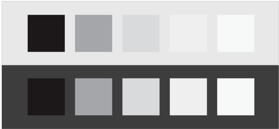
Visual Contrast
The answer is Johannes Itten from the Bauhaus. That’s Bauhaus the design school, not Bauhaus the band. t’s final form was in Berlin, where Ludwig Mies van der Rohe was the director. Before that, the Bauhaus was in Dessau, getting its start in Weimar in 1919. Many great names, and many great designs, trace back to this time. But in Weimar? In the start? There was Johannes Itten.
Johannes Itten taught art and color at the Bauhaus. Had a blast doing so, from what we can tell. “Play becomes joy, joy becomes work, work becomes play.”
While with the Bauhaus, Itten studied colors, establishing the fundamental categories for contrast: hue, light-dark, cold-warm, complementary, analogous, saturation, and extension. This work, specifically with contrasting seasonal color palettes, inspires painters and artists to this day. And nearly a century later, Christopher Nolan would turn to Itten’s desaturated and muted color palettes when establishing the mood of The Dark Knight Rises.
Contrast is what makes the visual beautiful.
Verbal Contrast
The communications expert Nancy Duarte studied storytelling and presentations. She looked at superhero movies, she looked at boardroom talks. “After all this study, it was a couple of years of study, I drew a shape,” Duarte recounted on the TED stage. “There is this commonplace of the status quo, and you need to contrast that with the loftiness of your idea.”
Duarte details her contrast model and shape in her presentation, The secret structure of great talks, and in her Resonate book.
It was a pattern I followed when establishing the vision for my monitoring program. I explained the status quo of audits and manual efforts. I painted the picture of automation and visibility. I showed where we were weak, and pitched how my team could be stronger. I leaned into the contrast. In the end? I obtained the funding for the SIEM and equipped my team’s Batman.
Contrast is what makes the verbal actionable.
Sell the Vision
“The objective laws of form and color help strengthen a person’s powers and to expand his creative gifts,” Johannes Itten once said. Duarte’s research shows similar laws of form and content strengthen a person’s persuasive powers.
Explain your vision by contrasting what is and what will be. Use this approach to gain buy-in, support, and budget. That’s how hire the Batman, and that’s how we get those wonderful toys.
This article is part of a series on designing cyber security capabilities. To see other articles in the series, including a full list of design principles, click here.
Posted by