Lateral thinking inspired by the Nintendo Game & Watch – Design Monday

Archive for the ‘Design’ Category

Lateral thinking inspired by the Nintendo Game & Watch – Design Monday

Posted by

Lack of sufficient budget and inadequate staffing, those are among the top challenges CISOs report when surveyed.

Oddly enough? No one ever asks CISOs what they have too much of.

With that one question, Gunpei Yokoi created the handheld video game console market. The Nintendo game designer was behind the Game & Watch and Game Boy. He called his combination of disciplined focus on play and radical use of legacy components “lateral thinking with withered technology.”

It’s a philosophy with repercussions for security leaders.

Withered Technology

When Yokoi spoke of withered technology, he meant technology which had matured to the point where it was plentiful, affordable, and well-understood.

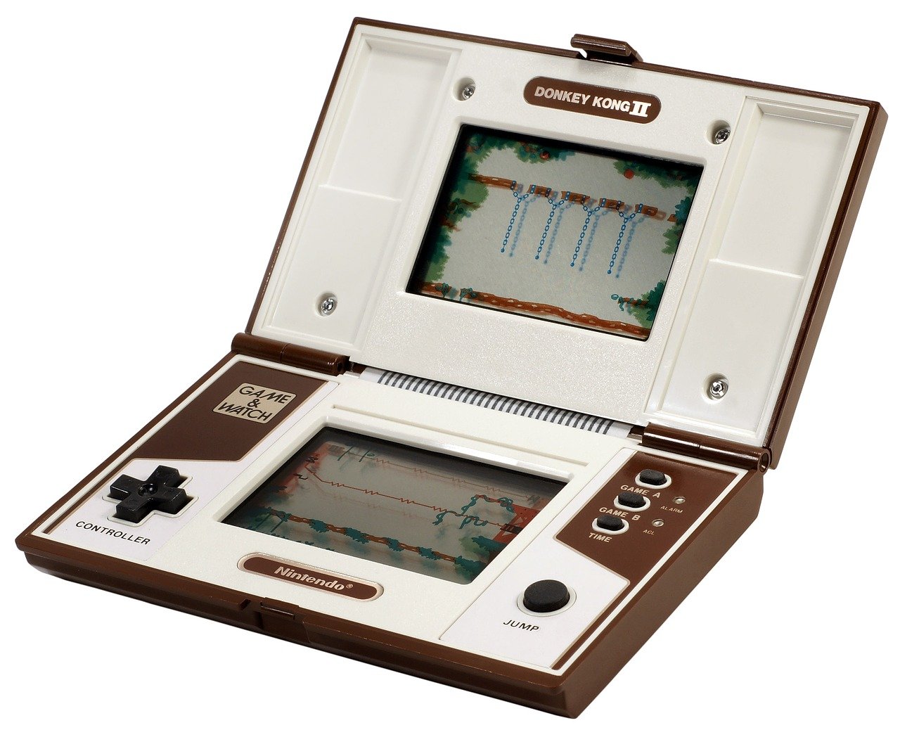
The Nintendo Game & Watch series was built on an advantage in the market which Sharp and Casio’s competition created. These two companies emphasized leading edge technology. The result was older black-and-white LCD calculator screens where readily available at a very low cost. Yokoi embossed the screen to compensate for manufacturing imperfections. To get color? Yokoi had colored lines printed on the embossed screen. This also reduced the need for lighting up the entire display, saving battery and extending game play.

The first way to apply Game & Watch thinking is finding similarly seasoned technology in our security stack. We might not have budget for an advanced user behavior analytics platform with machine learning. But we do have a logging platform. How far can we take what we have? Find the correlation-and-alerting equivalent of embossed-and-painted calculator screens.

A deeper way to apply Yokoi’s philosophy returns to the question: what do we have in abundance? I once collaborated with an organization that had built out an access review and certification process in IT service management. Why? Well, they had extra ServiceNow licenses. Abundance isn’t only technology, however, it can also relationships. I know another organization with strong relationships with marketing and corporate communications, who used this to great effect, producing a slick internal campaign which drove adoption of password vaulting.

In one context, it is withered. In another context, it is ripe. The trick is to see a new context.

Lateral Thinking

As a discipline, lateral thinking offers several methods for seeing things differently. One that comes to mind when studying Yokoi is the provocation and movement technique.

The first step is stating a provocation. This statement can negate the status quo, change the logical order of things, or exaggerate an aspect of the strategy. If our current security model depends upon network visibility, for example, one provocation would be “our defense doesn’t require anything from the network.”

The second step is determining how we move from our current thinking towards a context which satisfies the provocation. The general path is to extract a principle, focus on the difference between the contexts, imagine a movement to close the gap. Using the above example, that may be “we shift monitoring from the network to the endpoint.”

The Game & Watch version of Donkey Kong offers a perfect example of provocation and movement. The arcade version of Donkey Kong required a joystick. The variable resistance joysticks used in arcades required bulky potentiometers. The provocation is an exaggerated arcade joystick taped onto a Game & Watch. The underlying principle is up/down and left/right movement.

The resulting move was to create the plus-shaped cross control pad. These controls require only four buttons, fit the Game & Watch, cost a thousandth of an arcade joystick, and became Yokoi’s most widely copied innovation.

Ripening on the Vine

Yokoi’s “lateral thinking with withered technology” principle culminated in the Nintendo Game Boy. Released in 1989, it had a cross control pad and a black-and-white LCD. The processor was from the 1970s. Specifically, Sharp’s response to the Intel 8080 and Zilog Z80. In every way, the Game Boy was under-powered compared to the competition.

The Game Boy went on take the market, and to sell 119 million units. It remained Nintendo’s highest selling game system for nearly two decades. Nintendo DS finally overtook the Game Boy in 2016. And withered technology? Withered won.

Gunpei Yokoi began at Nintendo as a maintenance man working the assembly line. He once said, “I don’t have any particular specialist skills. I have a sort of vague knowledge of everything.” His strength was finding strengths in areas others overlooked, then strategically applying them to great advantage.

When determining how best to protect the organization, think like Yokoi, and look for areas of abundance ripening on the vine. Calculator screens, surplus processors, existing technology, working processes, strong relationships. Identify strengths. Be provocative.

Nintendo Game & Watch: Donkey Kong. Photo courtesy WikimediaImages from Pixabay.

This article is part of a series on designing cyber security capabilities. To see other articles in the series, including a full list of design principles, click here.

IKEA’s Billy the bookcase and modularity in IT security – Design Monday

Posted by

“Billy the bookcase says hello.”

“So does a table whose name is Ingo,” sang Jonathan Coulton in his IKEA song, “and the chair is a ladder-back birch but his friends call him Karl.”

I can’t speak for Karl. But Billy, well, Billy has an interesting backstory.

In the late 1970s, an IKEA advertising man named Billy Liljedahl complained about the state of bookshelves. They were heavy, expensive, and often missed the point by not actually being sized for books.

Gillis Lundgren, head of design at the time, began to sketch. “I drew the first sketches on a napkin,” Lundgren would later recall. “That was often the way we worked. Ideas are perishable and you have to capture the moment as soon as it arrives.”

Billy the bookcase would debut in the IKEA catalog in 1979. By 2009, IKEA had produced and sold more than 41 million bookcases. It remains one of the most popular products to this day.

Why? Regardless of Billy Liljedahl’s complaint, there were other shelves. IKEA had previously produced the Tiga. An early competitor inspired the Tiga: the Lundkvist shelf or Lundkvisthyllan. Not to mention the countless options we have today for shelving, storage, and more.

The reason is modularity, scalability, and extensibility. If there’s a room, if there’s a style, if there’s a need, there is a Billy configuration. The result has been pages on pages of Billy hacks. (Here are 45 ideas to get you started. Ironically, many without books. Sorry, Billy Liljedahl.) We’re seeing the power of architectural patterns playing out over 41 million use cases.   

When IT security leaders envision future security capabilities, we must ground them in repeatable patterns. A thousand apps individually implementing controls can quickly lead to sprawl, gaps, and waste. Equip these same teams with a pattern, say for authentication or fraud detection, and we can standardize the building blocks. Even if each app is different. Even if it looks as different as a standalone bookcase in a young person’s first apartment, or a built-in bookcase in an adult’s work-from-home study.

“Books should talk but the bookshelf should be silent.” This is the motto of the Lundkvist shelf. They never said hello. Perhaps that’s why Billy won the market.

And there’s a lesson for IT security. Products should talk but security shouldn’t be silent. Architectural patterns speak softly long after security has left the room.

IKEA Billy bookcase hack, via Willow Style Co.

This article is part of a series on designing cyber security capabilities. To see other articles in the series, including a full list of design principles, click here.

Telephones and the staying power of ideas – Design Monday

Posted by

Early hacker history is intrinsically tied to the telephone. Early hacker movies, too. Sneakers, WarGames. Hackers, Matrix, all have phones central to the plot. Yet before there was hacker history, there was phone history.  

The form factor of the telephone, at the dawn of the twentieth century, was the candlestick. That’s where the mouthpiece is on top of the stand, and the earphone is a cup you hold to your ear. This was the way a telephone looked for nearly forty years. The first phone to break free of this form? Came from the Bauhaus.

Richard Schadewell and Marcel Breuer designed the first cradle telephone in the late 1920s. Created for the Fuld Corporation and used in 1929 for the Frankfurt housing program, the phone is often called the Fuld or Frankfurt phone. Regardless of what you call it, Schadewell and Breuer’s design re-imaged the telephone. But it didn’t get much reach beyond Frankfurt.

Johan Christian Bjerknes and Jean Heiberg took the Fuld phone further with Ericsson’s Bakelite telephone. Ericsson began producing the phone in 1932, and it became popular across Europe. But the design did have problems. The handset was heavy, a problem when holding for an entire conversation. As time went on, repair and maintenance also became a growing concern.

Henry Dreyfuss began working the problem for Bell Telephone Laboratories. Dreyfuss studied the Ericsson and Bauhaus phones. He did field research with telephone repairmen. Dreyfuss studied how people used the phone, held the phone, moved with the phone. Dreyfuss then spent over two thousand hours prototyping, testing, and refining for usability and maintainability. The resulting telephone — Western Electric Model 302 — went into production in 1937. Dreyfuss designed the successor, Model 500, a decade later. The form factor of the 302 and 500 was the dominate phone design well into the 1990s.

Arguably, for fifty years after the 302, the only innovation on the American stock telephone was changing from rotary to push-button dialing with the Model 2500. Ask any hacker who was a kid in the 1970s or 1980s, and they’ll have a story about how they messed with the ubiquitous and cheap 2500 phone. Mine involves playing spy as a kid, “wiretapping” the phone. When Windows 95 and 98 arrived on the scene, the icon for telephony? The iconic Western Electric telephone.

Steve Jobs announced the first iPhone in 2007. He did so with an icon which traced back in time to the Bauhaus school. Our collective understanding of how a phone looks runs from Dreyfuss, to Bjerknes and Heiberg, back to Schadewell and Breuer.

The telephone offers many lessons. Adoption can make or break an innovation. Thinking about the end-user can lead to devices better tuned to their needs, even something as simple as the swoop of plastic that makes a handset comfortably rest on the shoulder. The customers are more than the end-users. Considering how the device will be serviced and maintained over its lifetime leads to sustainable designs. The backwards compatibility, too, provided by telephones is admirable. But when it comes to determining security controls, there’s a more powerful lesson.

The choices we make today will shape how the organization thinks for years to come. Ideas have staying power which outlives any given technology. Choose wisely.

Bauhaus Fuld telephone, Ericsson Bakelite telephone, Western Electric Model 302, Model 2500, Windows 95 telephony icon, iPhone 1 phone icon

This article is part of a series on designing cyber security capabilities. To see other articles in the series, including a full list of design principles, click here.

Premature simplification is the root of bad security – Design Monday

Posted by

The device changed our homes. It changed our perspective of time. In a way, it’s a story of miniaturization. They used to take up entire rooms, and suddenly could fit on a desk. It’s also the story of economics. They once were so costly only corporations could own them. With falling prices and shrinking sizes, it wasn’t long before every house had one.

The personal computer revolution? No. The sewing machine.

Our story begins a hundred years into the revolution. For most of those years, Singer dominated with black cast iron machines. Our design hero is Marcello Nizzoli, an Italian who refused to commit to any one discipline. He worked as a draughtsman, designed clothing and accessories, made advertisement posters, started magazines. Nizzoli’s collaboration with Olivetti was so successful, it set the standard for how Olivetti created teams of artists and engineers, paving the way for Ettore Sottsass to create the Valentine typewriter. When Necchi approached Marcello Nizzoli in the 1950s, Nizzoli had deep skills in precision machines and an instinctive understanding of those who stitch and sew.

The resulting Necchi Mirella Sewing Machine arrived in 1956. Nizzoli’s machine was light and beautiful. It features brightly colored enameled aluminum with a finely crafted metal drive mechanism. The Mirella won a number of awards and, today, is on permanent display at the New York Museum of Modern Art (MoMA). From contemporary accounts to modern documentaries, the consistent theme about the Necchi Mirella is this: user-friendly, ergonomic, and simplicity.

It was simple. We see this theme frequently when reading about good design. I return to the theme regularly in this series. Make it appealing, and keep it simple.

But simple is hard. That’s the problem.

Agreeing to Protect the Organization

Many CIOs and CISOs bicker like an old couple in a bad marriage. We make points, not progress. I wish we could watch pairs of executives argue it out and find what works. It’s too bad there isn’t an IT equivalent of what John Gottman and Julie Gottman have done with couples in the Love Lab. How can leaders have the tough conversations which lead to agreement?

Peter Coleman, inspired by Gottman, founded Difficult Conversations Lab to explore this question. What Coleman found is shocking: the root of the problem is our desire to simplify.

Our goal gets in the way of reaching our goal.

Coleman’s advice: get complicated. In conversation after conversation studied, complexity provided the space to reach agreement. When researchers framed the issue in black-and-white and primed the people with a similar simplified issue, the conversation became intractable. Often times, it was a short jump from intractable to “destructive spirals of enmity.”

The more we oversimplify requirements before speaking with peers and stakeholders, the less likely we are to come to an agreement. When we oversimplify early on, we fail to get buy-in. The resulting security controls won’t fit what the workforce needs.

Take the example of an identity. Let’s suppose we have people who change roles, going from contractor to employee. Suppose some people have multiple roles, say customer and employee. Start the conversation with the black-and-white control of all access and data being removed when a person is terminated. Watch how fast we get shutdown. An oversimplified approach leaves no middle ground for negotiating how identity gets defined and protected.

A Word of Caution

The lesson from Coleman, Gottman, and Nizzoli: Explore the complexity of the problem with the stakeholder, from their perspective.

Don’t explore the complexity with them from our perspective. If we want to enforce multi-factor authentication, we shouldn’t start by explaining complicated protocols and standards which enable MFA. But we should listen to the complex ways people work. Marcello Nizzoli’s success came from understanding how people sewed, not from explaining machinery to customers.

As we move from exploring the problem towards exploring possible solutions, we move from complexity towards simplicity. When defining the security capability, starting simple with an ugly prototype and iterating from there. When determining security controls, selecting the minimum requirements. Complexity as a starting point mustn’t be prolonged.

A Design Principle

“Premature optimization is the root of all evil in programming,” Donald Knuth once famously said. If you spent effort optimizing things before they are fully developed, you end up creating unnecessary work.

While the Necchi Mirella is praised for simplicity, Marcello Nizzoli arrived at the machine’s design only after spending years absorbing the complexity directly from those working in the clothing industry. Complexity, next empathy, then understanding, and finally simplicity. That’s good design, good programming, and that’s good security work.

Premature simplification is the root of bad security.

The Necchi Mirella Sewing Machine, designed by Marcello Nizzoli, 1956.

This article is part of a series on designing cyber security capabilities. To see other articles in the series, including a full list of design principles, click here.

Be Better, Be Different, by Asking these Questions – Design Monday

Posted by

This article comes with a recommended soundtrack: the soothing sounds of the IBM PC. The article also comes with a suggested color: beige.

If you’re thinking of beige and playing the sounds of yester-year, you’re ready to come with me on a trip of nostalgia. It was the late 1990s and several years into my career. I had spent time wiring up IBM computers to Novell NetWare servers. I had run a systems integrator business, assembling computers for the local market. The turn of the century found me at a value-added reseller who specialized in mixed Microsoft and Apple environments, which was tricky back in the day.

That’s when beige turned to color. That’s when the world grew quiet.  

The Apple iMac had arrived.

The industrial design work was led by Jony Ive. Ive pushed the Most Advanced, Yet Acceptable (MAYA) principle to its limit. The original Macintosh was an all-in-one form-factor. The iMac was, too, but with a Googie spin. It felt like a Jetson’s computer. But Apple was clear it was an Apple. The 1984 Macintosh said “Hello.” The 1998 iMac? “Hello again.”

As pretty as it was, the iMac was no toy.  “The iMac isn’t about candy-coloured computers,” Jony Ive said. “The iMac is about making a computer that is really quiet, that doesn’t need a fan, that wakes up in fifteen seconds, that has the best sound system in a consumer computer, a superfine display. It’s about a complete computer that expresses it on the outside as well.”

The iMac featured:

  • Sleek, curved, translucent in a time when all computers were square
  • A departure from legacy tech; such as the floppy disk drive, serial port, and the SCSI port
  • An embrace of emerging standards; USB, Ethernet, and WiFi
  • An integral architecture; say when a CRT mount also reduces heat and increases beauty  

None of this is an easy leap to make in a design. We tend to benchmark and copy the success of others. For example, a wave of translucent colored plastics crashed over all product categories following the iMac’s success. Walk the vendor arena at the next major conference to see the same thing happen in cyber security. Another challenge is in letting go of the past. Dell still offered computers with floppy disk drives in 2006, nearly a decade after Apple moved on. Many security programs have a similarly hard time letting go of processes and technology, long past when they’ve stopped adding value. It’s hard.

When developing the technology architecture for a new security capability, channel Ives by asking the following questions.

  • How can we challenge old assumptions about how things are done?
  • What are we currently doing that we can simply stop doing?
  • What technology do we have today that we can repurpose into something useful?
  • How can we make our work attractive to end-users?

I never forgot the first time I saw the iMac, when I heard the iMac. Beautiful. Whisper quiet. The VAR I worked with at the time was an Apple partner. They also sent us a full set of promotional posters. One still hangs in my study today. Think Different. If only it was that simple.

“The thing is, it’s very easy to be different, but very difficult to be better.”
– Jony Ives

Afterward

Ken Segall is an ad man and the author of Insanely Simple: The Obsession that Drives Apple’s Success. Segall is also the man who put the i in iMac. Steve Jobs originally had a different opinion. “He wanted us to come up with a really good name, he called us in one day and said I have a name that I really like, we’re going to go with it, but if you guys can do better we need you to do better within the next two weeks. So his name was, yes it’s true, MacMan.”

Listen to him as Ken Segall tells the story on YouTube. It’s a reminder that, with computer products or security projects, the name tells a story.

Apple iMac G3 and iBook, image courtesy Wikipedia.

This article is part of a series on designing cyber security capabilities. To see other articles in the series, including a full list of design principles, click here.

Identify friction with better data visualizations – Design Monday

Posted by

All maps are wrong. They simplify geography. They obscure detail. All maps are wrong. Some maps, however, are right in the moment.

Take cartograms. These are one of my favorite data visualizations. You’ve likely seen one during an election, abstracting states to show the population. Cartograms relish being wrong about geography. They toss land accuracy to the wind. Instead, they show one key datapoint. Clearly. Convincingly.    

The grandfather of the modern cartogram is Waldo R. Tobler.

Tobler pioneered computer-aided cartograms in the 1960s and provided researchers software into the Internet age. Frustrated with manually drawing maps, he tapped into the computing power of the University of Michigan. The results were the first algorithms for cartograms and one of the first computer movies: A Computer Movie Simulating Urban Growth in the Detroit Region. Take that, Pixar! Anyone who wrote to Tobler would get a reply with a floppy disk of code and research. As technology evolved, that little floppy would become a compact disc (CD), and finally posted online as free software (2003).

In a remembrance of Tobler, Benjamin Hennig wrote: “He made no distinction between the hierarchies in academia and gave young scholars the same respect and attention as senior academics, acting as a mentor and source of inspiration to many of them.”

Tobler was an open source map hacker.

Cyber security is in desperate need of data visualizations. We have numbers about port scans. We measure the easy things, from the number of emails received to the number of phishing emails reported. These roll up into bar charts, trend lines, and pew-pew maps. But do these visualizations actually communicate the data point we need to take action?

We need maps of what matters, not what’s happened. We need to see how data relates to fact.

“Everything is related to everything else, but near things are more related than distant things.” This is Tobler’s first law of geography. It’s applicable to security design. Consider the paths people take to complete work: number of steps, familiarity, and friction of each step. The more steps IT or cyber security places in the way, the longer the path, the greater the friction of distance.

We need visualizations that surface work arounds and work hacks. These security policy violations appear in result to friction. Identify these, and we’ll know where to adjust the design of controls.   

All metrics are wrong. They simplify and obscure. A well-designed metric, like a well-designed cartogram, can surface hidden truths about how people navigate the systems we build.

Identify friction with better data visualizations, then reduce the steps and improve the experience. That’s one way to increase compliance and adoption.


Source: Cartogram Visualization for Bivariate Geo-Statistical Data. Sabrina Nusrat, Md. Jawaherul Alam, Carlos Scheidegger, Stephen Kobourov.

This article is part of a series on designing cyber security capabilities. To see other articles in the series, including a full list of design principles, click here.

Listening to users is the start not the end – Design Monday

Posted by

Good design starts with listening to the user. This is the starting point for good security, too. But if we look at the LEGO playsets my kids grew up with, we can see how simply listening to users only gets us so far. In fact, given some of the outrage LEGO faced, it’s clear listening can even get us into trouble.

After nearly going bankrupt, LEGO turned to design thinking to reimagine its toy line. LEGO partnered with PARK to develop a design process. The process begins with exploring, begins with field research, beings with actually talking with the kids.

Imagine LEGO researchers sitting with ten-year old boys. Imagine it is around 2008 or 2010. Imagine the researchers showing the boys posters of minifigures. Minifig super-heroes fighting aliens. Minifig samurai. Minifig ninjas. Minifig action-heroes fighting mechwarriors. The question was, which stories were most exciting to the kids? What sparked play?

Ninjago was the result. A set of ninja minifigs which battle with skeletons on a spinning or flying disks. This would spawn over 250 playsets and a television series that ran for ten years, and is still being produced as of this writing. 

Fresh off the smash hit of Ninjago, flush with excitement of finding great ideas by actually talking with kids, LEGO replicated the design process with LEGO Friends. This time imagine LEGO researchers sitting with ten-year old girls. Same process. Different results. Girls expressed different play and different preferences. One insight I read, for example, was the minifigs needed fashionable shoes.

When LEGO Friends hit in 2012, it faced almost immediate public backlash. Many felt it reinforced stereotypes with pink bricks and scenes like shopping and childcare. Others felt it reinforced gender segregation, as the minifigs (redesigned for shoes) in the LEGO Friends set weren’t compatible with other minifigs and standard sets.

Seven-year old Charlotte Benjamin wrote a letter that captured the frustration. “Today I went to a store and saw LEGOS in two sections, the pink and the blue. All the girls did was sit at home, go to the beach and shop, and they had no jobs but the boys went on adventures, worked, saved people, and had jobs, even swam with sharks.”

LEGO had learned how to listen carefully to the kids. The problem was they hadn’t listened to the opinions of the parents, educators, and other stakeholders. Both young boys and young girls gave great feedback, feedback which resulted in great toys. Like Ninjago, LEGO Friends currently has over 250 sets, with television and other media. But the tight lens on the end user during exploration meant LEGO didn’t look beyond the playset. By not considering the wider context in which play happens, they fumbled the release.

This is an easy mistake for cyber security architects and designers to make.

We embrace the idea of empathy as the heartbeat of the design process. Flush with early successes, we listen closely and carefully to one segment of our workforce. Let’s suppose it is the finance team. Let’s further suppose we collaborate to reduce some security controls here, tighten others there, reducing friction for the team. Success! Except, six months later when the auditors come in, we realize our changes resulted in audit evidence no longer being collected, leading to a failed audit.

We addressed the needs of our target audience without considering the wider system in which they played. Hypothetically speaking, of course. Right. Back to LEGO.

“We listen very carefully to the opinions and input that people share,” LEGO wrote in the press release in response to the LEGO Friends uproar. “We will continue to do so as we develop the LEGO brand to deliver the best experiences with the strongest appeal, and we will review our communications to ensure that we represent LEGO play for all children.” With sets like the Research Institute (women chemist, paleontologist, astronomer) and with the LEGO movies, we can see LEGO’s design thinking process improves by widening the lens for field research.

Listening to users is the start, not the end.

When designing cyber security capabilities, listen carefully and consider all of the stakeholders. When our work helps people swim with sharks, we better remember the shark.

Afterwards

I learned of these stories from David Robertson. He wrote the book on LEGO’s recovery, Brick by Brick: How LEGO Rewrote the Rules of Innovation and Conquered the Global Toy Industry. Robertson also covered the LEGO story in a wider context in his recent book, The Power of Little Ideas: A Low-Risk, High-Reward Approach to Innovation.

LEGO Friends, photography courtesy Huw Millington

This article is part of a series on designing cyber security capabilities. To see other articles in the series, including a full list of design principles, click here.

Define what we do by what we don’t – Design Monday

Posted by

“The essence of strategy is choosing what not to do.” — Michael Porter

Enzo Mari often repeated “form is everything.” The Italian designer produced thousands of works, staying active until his death in 2020 from Covid-19. Mari’s work has a clarity and cohesiveness which cyber security often lacks.

“Enzo Mari is a total work of art,” said Hans Ulrich Obrist. “Everything went together with him.” Hans Ulrich Obrist, director of the Serpentine Gallery in London, was developing a retrospective on Enzo Mari before the pandemic hit. Mari was the master of individual form, and a master of collective form, unifying them a cohesive whole. One could spend a lifetime as CISO and still not build a security program as unified as Mari’s 16 animali puzzle.

“There is only one right form, not several,” Enzo Mari insisted. To get to the essence of the form, the designer must strip away everything. Everything. The designer must explicitly decide what the design is not, in order to make the design what it is. Take the Timor calendar. Compare it to your calendar. There’s no writing in the margins. There’s no tabs or colors, no holidays or birthdays, no reminders, and certainly no notifications. There is no excess. Timor is a calendar. Nothing else.

It is bold to say no. It takes courage to say what we will not do.

Suppose we are designing a software security program. For the purposes of this example, suppose we are lining it up to OWASP’s Software Assurance Maturity Model. SAMM has fifteen practices and forty-five objectives. Most security professionals would focus on getting a handful right. Most would speak loudly about what’s being done, and mumble about the objectives that are being ignored. Instead, we should channel Enzo Mari. Banging a fist on the table, we should declare which practices we will not do. By saying no, we create space and commitment. Only then can we build the committed practices, working towards something that fits like one of Mari’s puzzles.

Good security is clear about what it doesn’t do.

Obrist’s exhibition is currently on display at the Triennale Milano (Enzo Mari curated by Hans Ulrich Obrist with Francesca Giacomelli). It may be the last public showing. If Enzo Mari’s work can be defined by his declaration of what his work isn’t, then Mari’s last act is a defining one. Mari bequeathed his collection to the city under the condition that none of it be displayed for 40-years.

Simplicity in form, Timor Desktop Calendar, designed by Enzo Mari

This article is part of a series on designing cyber security capabilities. To see other articles in the series, including a full list of design principles, click here.

Tell a story with the project name – Design Monday

Posted by

The city is a book of poetry writ large across buildings. Santiago, Chile.

During the mid-1990s, Santiago went through building boom. The game was simple. A development investment project would be conceived and pitched. If the enough investors were interested, the project was funded, and the building was built. An apartment building here, an office building there. And key to the success of getting funding? The name.

Rodrigo Rojas, a poet and professor, played a key role in naming these buildings. “Rodrigo was a kind of interpreter of dreams — he tapped into the psyche of what the people of Santiago wanted to become, and tried to give that a name.”

Every project needs a name. Unfunded real estate projects and security projects, doubly so. Here are a few things I’ve learned from naming projects.

Be playful and fun. In my consulting days, to protect confidentiality, we wrote a name generator. We dedicated a portion of the project kick-off to laughing over possibilities. With names like Iron Taco and Gubbins Dance, you can’t go wrong. Security needs a spirit of play.

Share the vision. “One system, one team” was what I called my DevOps and IT modernization project. The clarity of the name simplified sharing the vision and making downstream decisions.

Address concerns. When I received feedback that my approach to managing several consulting practices was too complex, I came up with a three year roadmap in three words. Simplify, optimize, expand. One word per year. We executed on this from 2017-2019, with quarterly goals reinforcing the overall journey.

We need to find the spirit of a poet when naming security projects and initiatives. Tell a story with the name. Make it fun, while communicating the vision and addressing any concerns. We can use the name to drive action.

Photography courtesy of Horst Engelmann, Pixabay

This article is part of a series on designing cyber security capabilities. To see other articles in the series, including a full list of design principles, click here.

Find your own way without brainstorming or crowdsourcing – Design Monday

Posted by

Imagine you are getting onto a train. Drive. Park. Traverse the crowds. Find the train. Sounds simple and, in many places, it is simple. But Millbrae Station is a difficult space to navigate. In fact, locals would tell you to find somebody to guide you. At least, for the first couple times, because it is easy to get lost. Bring a friend. Recently, San Francisco’s Bay Area Rapid Transit (BART) brought in studio1500 to design a better way.

The challenge was bigger than the space. There is an information system which guides people through the BART public transportation system. Broadly, this known as wayfinding. Specifically, in San Francisco, this was a set of design choices made by different firms at different times. BART’s internal team would be implementing the wayfinding system at Millbrae Station. The colors, typeface, paint choices, all these and more had to come together in a design that coordinated and communicated with multiple parties. One final consideration was how the design would be kept up. Public transportation departments routinely touch-up and refresh signage over the lifetime of a project. 

Wayfinding is an analogy for thinking about how people navigate the various screens, sites, security systems, prompts, and challenges. Our workforce navigates wayfinding systems done by others (say, WorkDay and SalesForce) at the same time they’re working through what we control (say, VPN and SSO). An example of a wayfinding design, across multiple environments, with strong need for maintainability, such an example is fertile ground for cyber security lessons.

Returning to Millbrae Station, you might expect the story to begin with a brainstorming session with the studio1500 partners Julio Martinez and Erik Schmitt. You’d be wrong. It’s cool. I was wrong, too. In fact, Martinez himself wrote: “I assumed life in a design team would be full of brainstorming sessions — mythical, lively, fast-paced meetings with brilliant ideas bouncing off multiple heads until they were captured in someone’s notebook as shiny kernels of greatness. There would be roars of celebration and laughter, hugs and high-fives, uproarious chants.”

Several years ago, I took an improv course. During my time spent learning how to Zip-Zap-Zop, I realized I wasn’t fast at coming up with ideas. Someone would shout a premise, I would freeze, and others would jump in. This wasn’t surprising. After all, I took the course because I felt slow. I decided to take each improv class twice. Double down. Work through it. And here is where I ran into a surprise. Across different classes, with entirely different teammates, with different composition of ages and backgrounds, the exercises were remarkably the same. I froze. Others jumped in. But no matter who it was, in both classes, people made essentially the same joke.  

Free association isn’t all that free. It’s bound by shared experiences and cultural expectations. 

David Palermo and James Jenkins studied free association with words in the 1960s. Simon De Deyne is studying this today. (Check out https://smallworldofwords.org to participate.) If you give someone a word, you can be reasonably certain what word they’ll think of next. Likewise, if you give someone a premise, you can be reasonably certain what they’ll improvise. Our first instincts feel creative but actually repeat what most anyone else would do. 

Brainstorming tries and fails to avoid the work of preparation and contemplation.

Mihaly Csikszentmihalyi, the psychologist who popularized the concept of flow, once said there are five stages in the creative process. This was after interviewing a hundred designers and artists, including Don Norman, so we can assume Csikszentmihalyi was on solid ground. The five steps are: preparation, incubation, insight, evaluation, and elaboration. Incubation can take days, weeks, or months. Scheduling a brainstorming session for a Tuesday at 4 o’clock, showing up, and jumping to insights feels tantalizingly innovative. But it ignores decades of research into how creative work gets done unconsciously.

Okay, but what does improv have to do with wayfinding, you ask?

“This dance between the conscious and the unconscious is important,” Martinez explained. Instead of brainstorming, they read the brief. They walked the site. Martinez made time for his observations and intuitions to gel. When studio1500 presented to BART, they came with a number of thoughtful options for the Millbrae Station. They came with ideas to discuss and build upon.

“Our approach is antithetical to the classical Paul Rand model of design. You have one idea. You show up. It is a God-given idea and it is done. Take it or leave it.” Martinez said, contrasting studio1500‘s approach. “We like to play. We like to think as we’re designing. It’s collaboration. It’s iteration. It’s actually how you figure the ideas out.”

The Millbrae Station wayfinding would go through a few iterations. The design firms working within and without gradually got onto the same page. Martinez worked to make sure the vision was translated and executed properly. This meant simplifying the design a bit, choosing colors that were more maintainable. It also meant some rework to get the typeface correct. Each change required thought, but none required a storm of ideas and flurry of sticky notes.  

Brainstorming is theater. As security theater makes us feel secure without actually increasing security, brainstorming makes us feel insightful without producing insights. 

Don’t feel pressured  to crowdsource or brainstorm ideas. Prepare by setting a vision, thinking through how to protect the organization and define the security capability. Give it time to seep into your subconscious. You’ll be ready the day comes for creatively defining architecture and controls.

When designing cyber security capabilities, find your own way.

Afterwards

In past articles in this series, I’ve covered four of my preferred ways for exploring problems and discovering new possible solutions. These are:

Julio Martinez recommends James L. Adams’ book, Conceptual Blockbusting: A Guide to Better Ideas. The book is now on my end table.

Bay Area Rapid Transit (BART) Map, Courtesy Wikipedia

This article is part of a series on designing cyber security capabilities. To see other articles in the series, including a full list of design principles, click here.